Anyone know where my mojo went?
Seriously, I'm just so out of it right now. I think it comes from sleeping again, lol. For so long I didn't sleep well and I tried everything to get some sleep. So after my surgery I was in my room at 3am with my roommate, who had her hip replaced and was in agony. There was way too much light, consquently I asked if there was anything they could give me to help me sleep. Even on heavy pain medication after back surgury, I wasn't going to sleep, lol. The doctor gave me some meds and I actually slept for 4 hours! When I was released I asked if I could get a script, explaining how little I've slept in the last 6-8 years and everything I've tried to help it. So the Dr. gave me the script and I've kept taking it. It really does help me sleep. I'm actually getting about 6-7 hours of sleep a night, but I found it affects my ability to be creative, lol. My dh doesn't believe me when I say: there is absoultely NOTHING in my head! lol. When I try to create kits, quick pages, etc nothing is happening! So I'm trying a different approach. I'm going back to doing layouts for my dd's. Maybe while I'm creating the layouts, I'll need to create paper or elements for them and that will lead to freebies or kits, lol. It can't hurt anyway, I'm so far behind, lol.
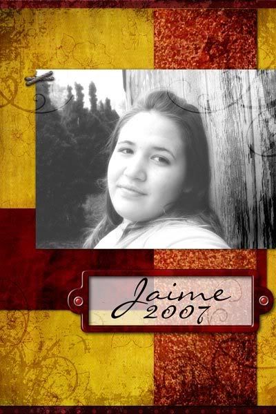
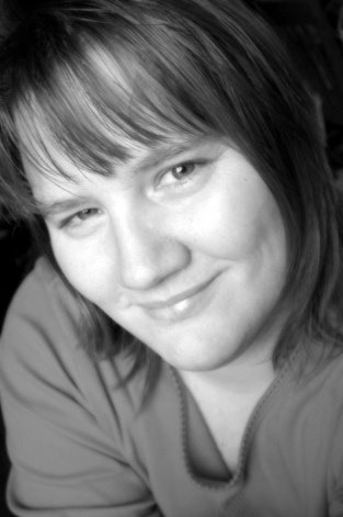
So today I did 2 cover layouts for my dd's "yearbook".
I can't decide which one I like best
My daughter took this photo herself (I'm so proud of her!!)


I used papers and elements from Digi By Design's monthly team kit Tickets Pleaseas well as a few other papers and elements (see full description here)
Thanks for stopping by
maryanne
ps. I just got an idea for a freebie, if you get a chance check back in a bit. I'll see if I can pull it together.


2 comments:
Both layouts are beautiful, but I really like the top one! And your daughter is a wonderful photographer!
The top layout is more elegant because its title enhances the beautiful colors of the layout without competing with your daughter's face as the title in the bottom layout does.
Post a Comment